Wireframes: Plan a Useful Interface Before Styling
Use simple wireframes to organise content, clarify user tasks, and discuss layout before polishing the visuals.
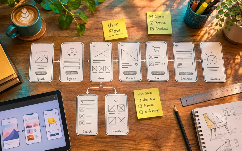
Start with a task
Choose a specific activity, such as finding a course and submitting an enquiry. List what a person needs to know at each step. Sketch the shortest understandable path through those decisions. A wireframe is more useful when it answers a task than when it simply fills a screen with boxes.
Arrange real content
Use realistic labels and a representative amount of text. Place the most important information where someone would expect to find it. Show relationships between headings, descriptions, and controls. Avoid replacing every line with a grey bar, because that can hide problems with wording, length, and priority.
Show states beyond the first screen
Include empty results, validation feedback, and successful completion where the task requires them. Mark what changes after a button is selected. These states reveal missing decisions early and make the design easier to discuss with developers, writers, and anyone responsible for the service.
Walk through and revise
Ask a person to describe what they would select next, without coaching them. Note uncertainty about labels or the order of information. Revise the wireframe before spending time on shadows and colour. Keep a short record of the issue and the change so your process is visible.
Explore related courses