Responsive Layouts: Let Content Lead the Design
Plan layouts that adapt from small screens to wide displays while keeping text, images, and controls usable.
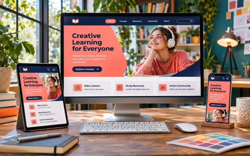
Begin with the essential content
List what visitors need to see and do before choosing column counts. Arrange the smallest layout in a useful reading order. When there is more room, expand the composition rather than introducing a different information hierarchy. This keeps the experience understandable across screen sizes.
Use flexible structure
Allow columns, gaps, and images to respond to available space. Avoid fixed widths that exceed a narrow viewport. Set sensible minimums and maximums for reading areas and media. A design should accommodate longer words and user-entered content without depending on one carefully selected screenshot.
Choose breakpoints from the layout
Resize gradually and note where content becomes cramped or lines become uncomfortable to read. Add a layout change at that point. Device names alone are not a reliable guide, because browser windows, text settings, and split-screen views create many sizes between common phone and desktop examples.
Test difficult cases
Review long headings, missing images, wide tables, and enlarged text. Check that navigation and forms remain reachable. Use both narrow and wide previews, then inspect sizes between them. Record the issue and the fix so your portfolio demonstrates responsive behaviour rather than only two isolated mockups.
Explore related courses